Led the design of the company’s e-commerce experience from concept to launch, developing user-centered layouts that improved product discovery and supported conversion goals. Collaborated closely with developers to ensure accurate implementation while establishing a consistent visual hierarchy and cohesive branding across all pages.
My Role
Sole designer
Led UX/UI
Collaborated with 2 frontend developers
Worked with marketing team
team
Me- UX/UI Designer, Lead Designer
2 Front-end Developers
3 Back-end Engineers
2 Marketing people
Tools
Photoshop, Figma
E-commerce Website Design
I was responsible for designing all pages of the website. This involved understanding the company's requirements, offering design concepts, and validating them through user feedback. Additionally, I enhanced the user experience and interface design of key platform areas.
Problem and Challenge
The main challenge was designing the entire e-commerce website by myself under a tight deadline. There was no previous experience or support for e-commerce website design within the team, so I had to conduct extensive research and learn independently.
Project Goals
Our goal was to create our first e-commerce website, similar to Amazon.com, to attract and retain customers. We aimed to make the site engaging and easy to navigate while reflecting our brand identity. Additionally, we focused on maximizing sales potential by enhancing user engagement and streamlining the shopping experience.
Solutions
To meet our goals, I researched e-commerce best practices, created a project plan, and stayed aligned with developers and marketing through constant feedback. This teamwork allowed us to deliver a high-quality website on time.
Design Process
I started by analyzing company requirements, then created wireframes and prototypes. Through feedback and usability testing, I refined the designs to ensure a smooth user experience and functionality.
Collaboration
I led the design process and worked closely with marketing and developers. Through feedback and collaboration, we refined the designs to align with our goals and brand.
Wireframes
I created several mockups of wireframes, which I suggested to the web developers. These wireframes served as the foundation for the final designs, ensuring that all elements were well-organized and user-friendly.
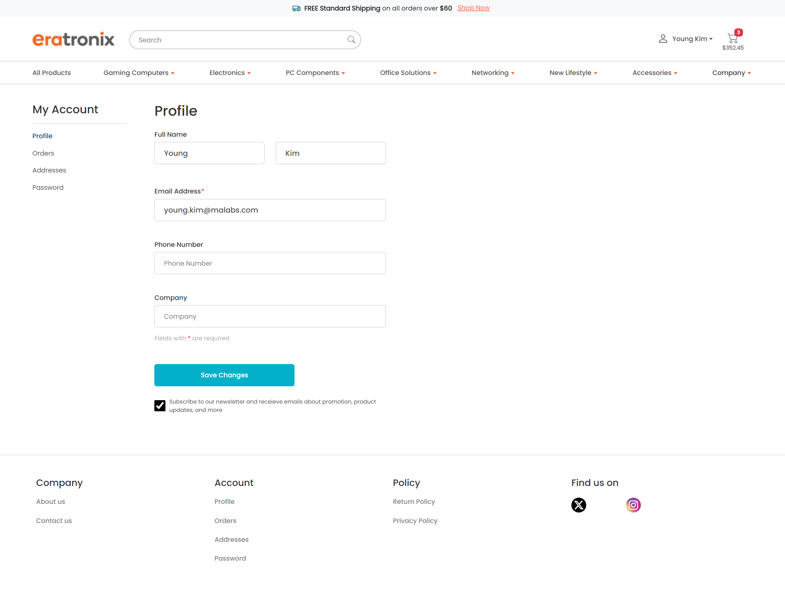
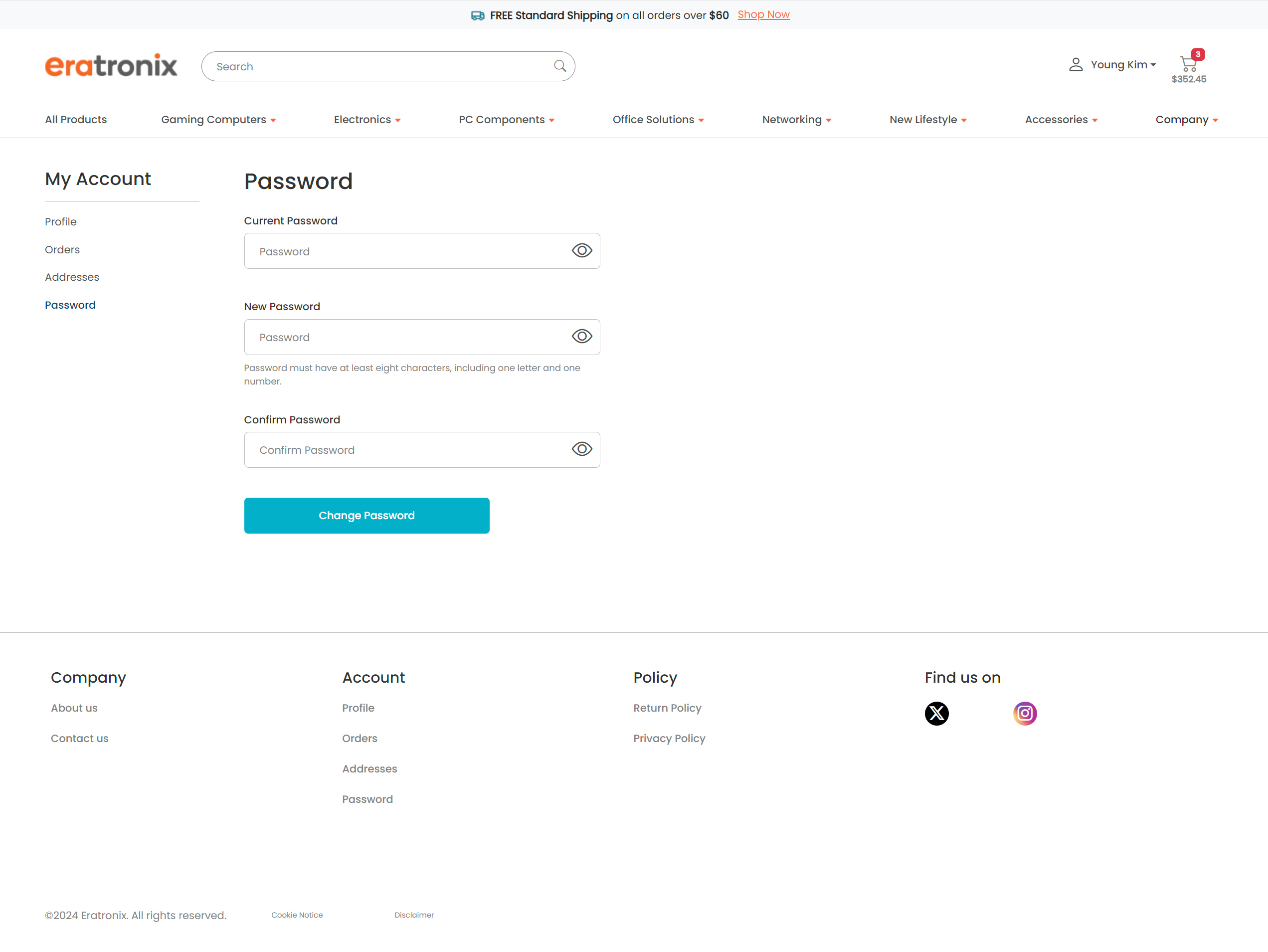
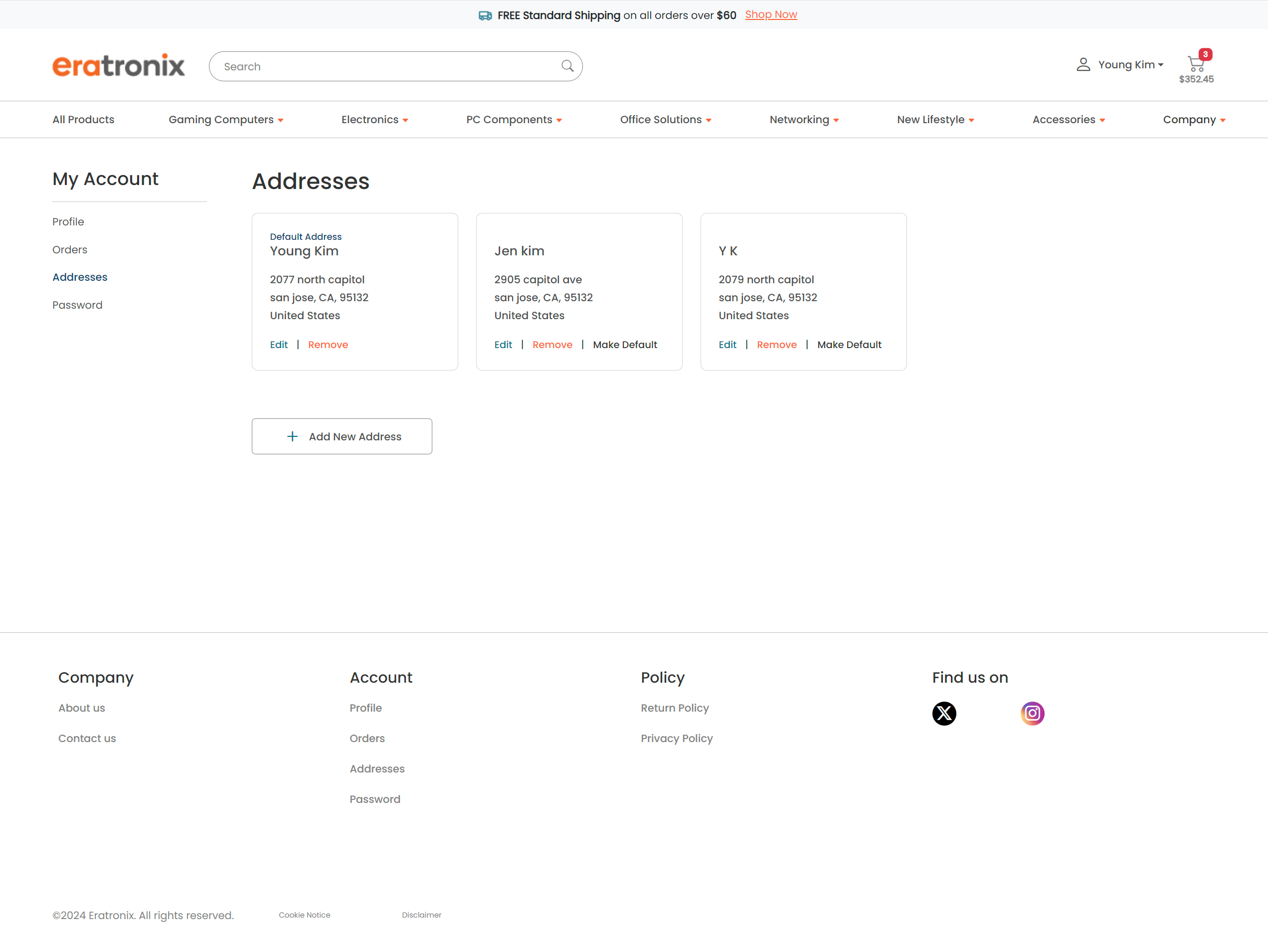
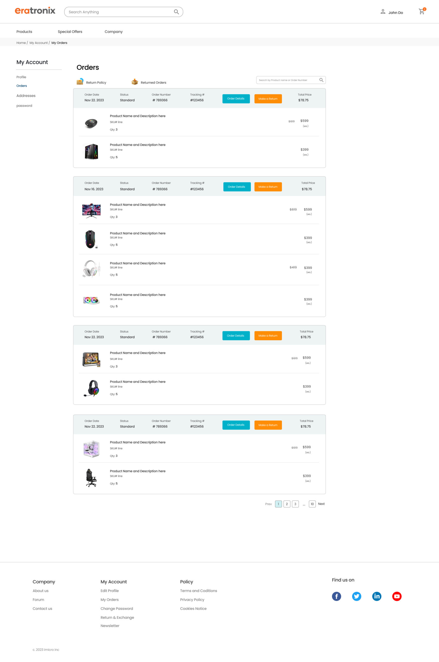
My Account Pages
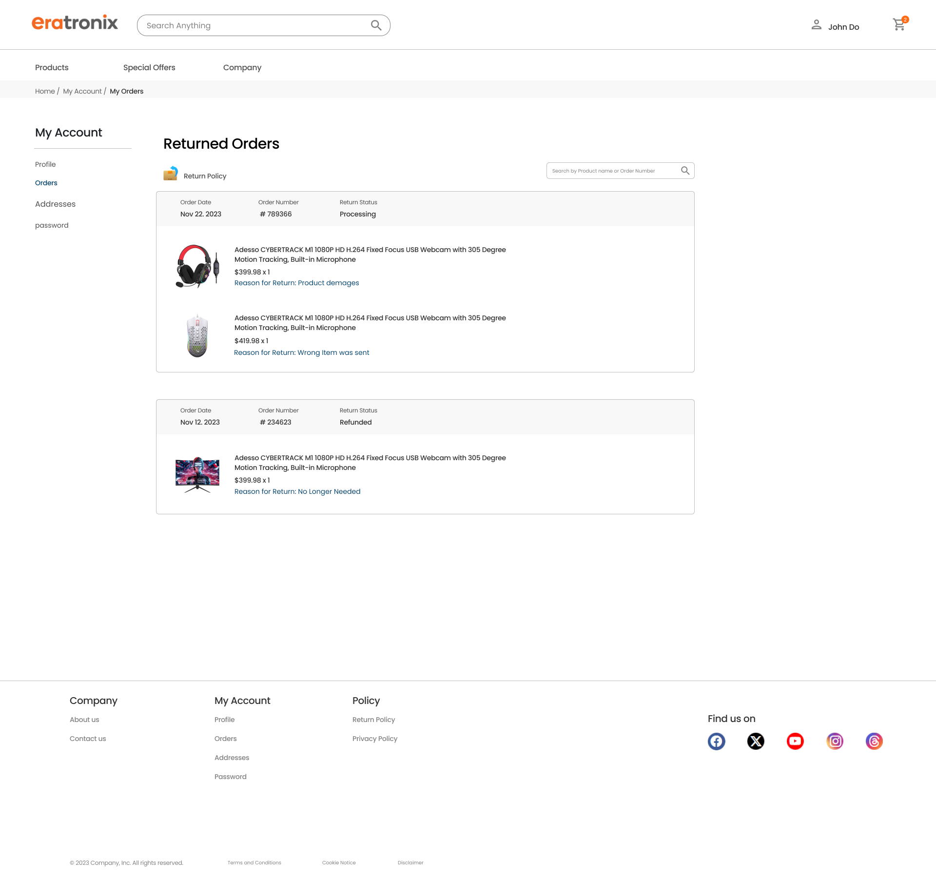
I redesigned the “My Account” section with menus for Profile, Orders, Address, and Password. I worked closely with developers on the “My Orders” page to ensure smooth usability, including key features like returns and order details.
My Profile page
Password update
My Address page
My Orders page
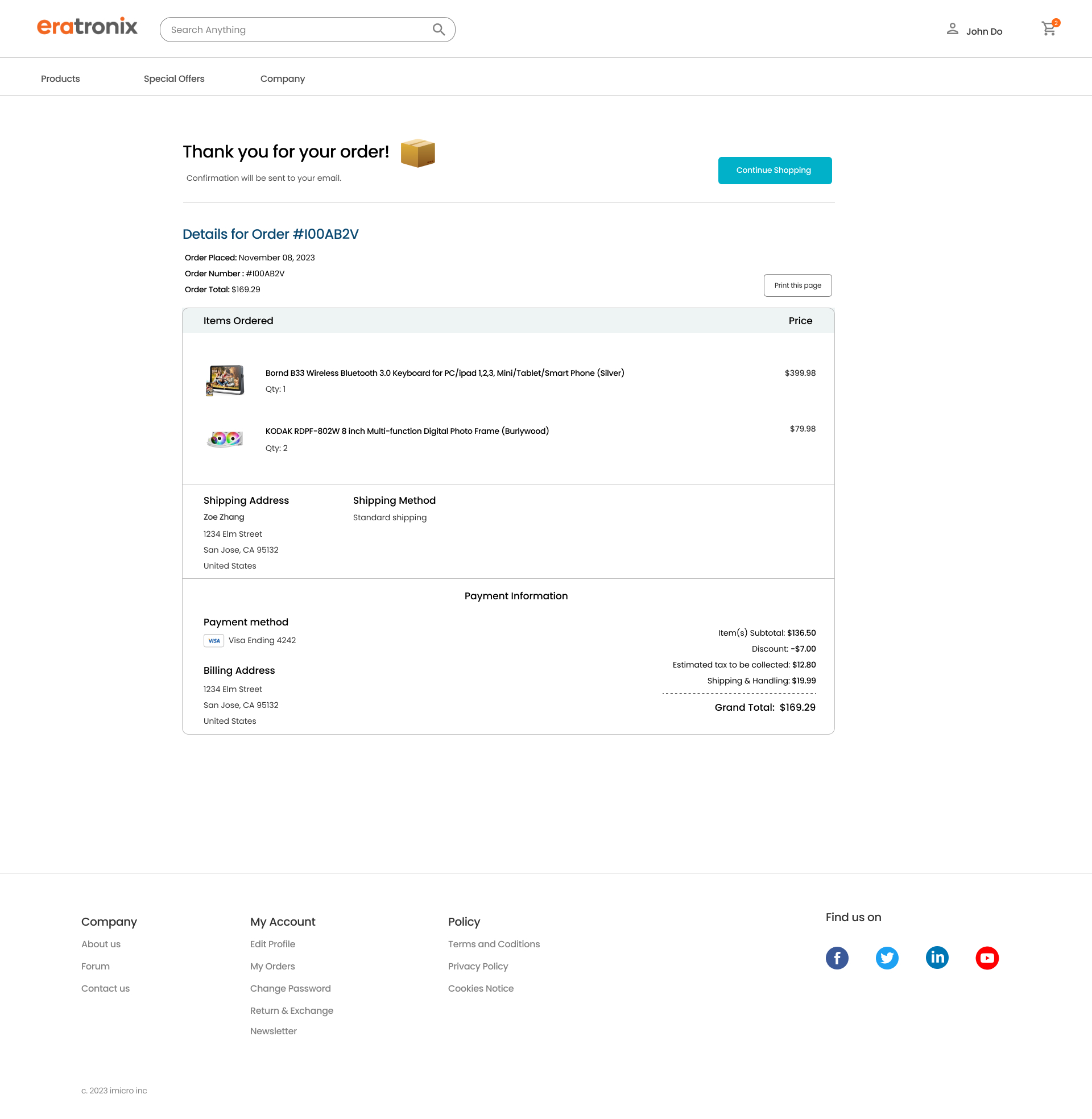
Order Confirmation page
Returned Orders Page
Check out Pages
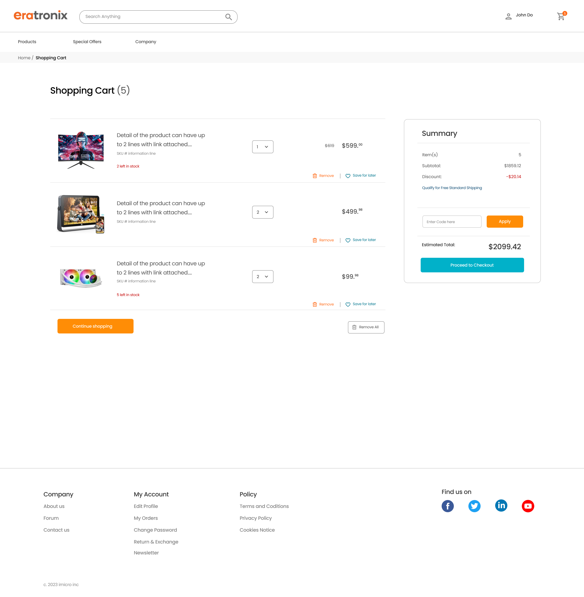
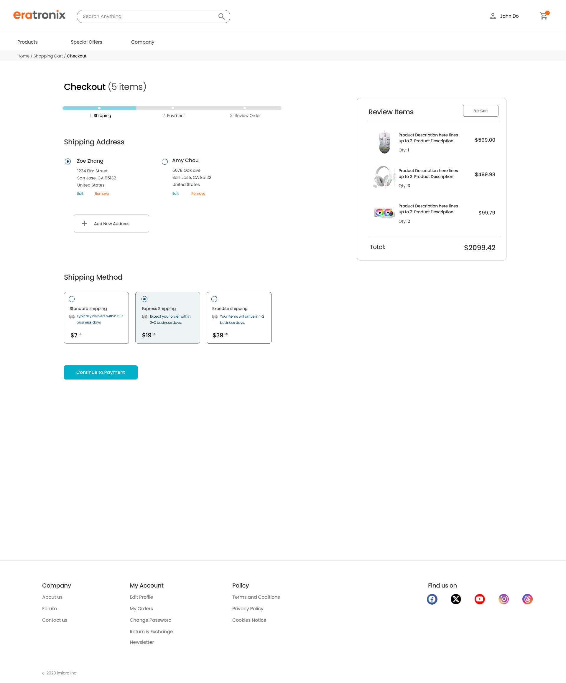
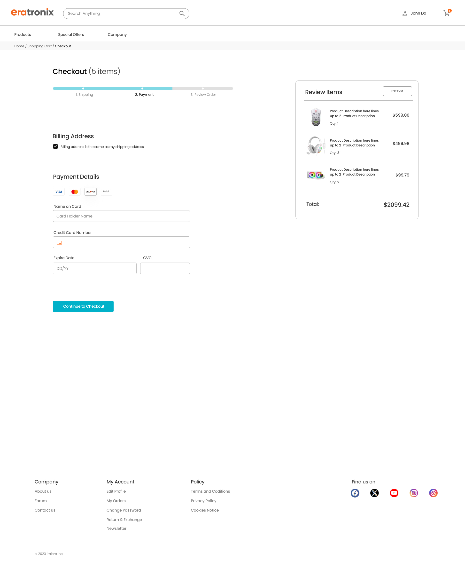
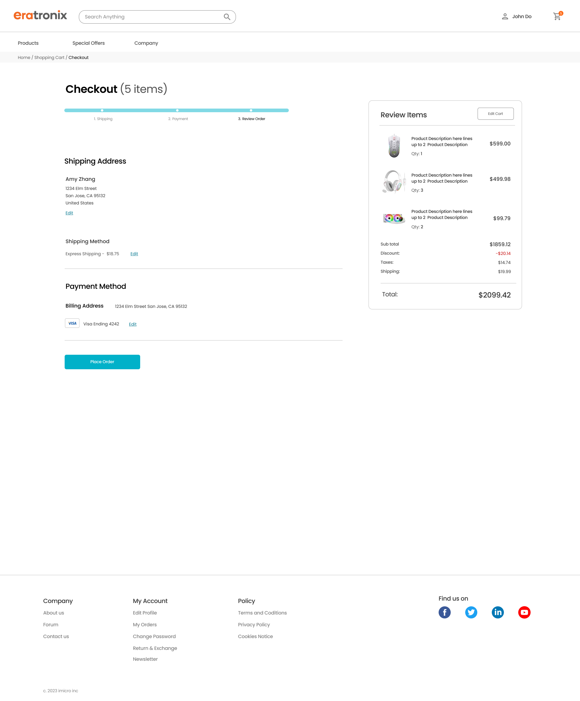
I improved the layout for the checkout pages, collaborating closely with the web developers despite facing some initial conflicts due to functional restrictions. To address these challenges, I proposed several versions of the checkout process, putting in significant effort to find the best solution. Through this iterative process, we were able to arrive at a solution that satisfied both parties, enhancing the overall user experience.
Shopping cart page: Order Summary, Item Remove, Save for later button
Check out phase-1: Shipping Address, Shipping Method
Check out phase-2: Billing Information, Payment information
Check out phase-3: Review order, Update Address and payment info. Confirm order
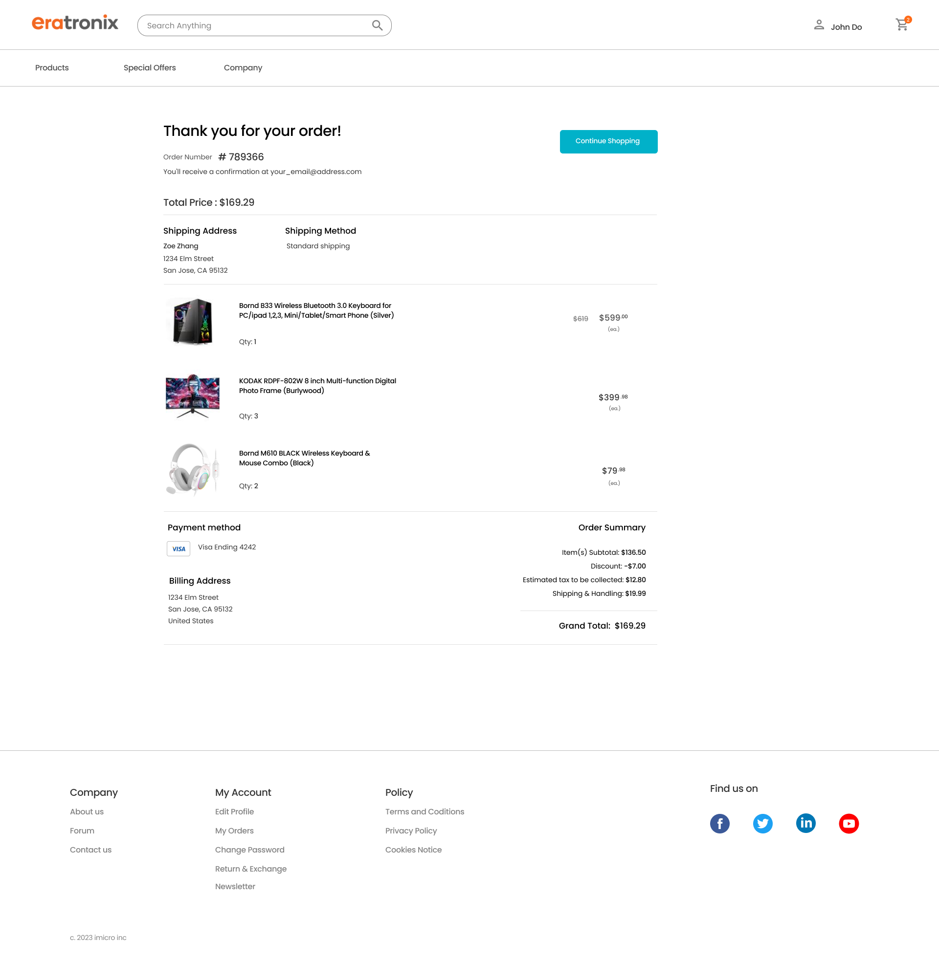
Order Confirmation page: Detailed item information. Order summary
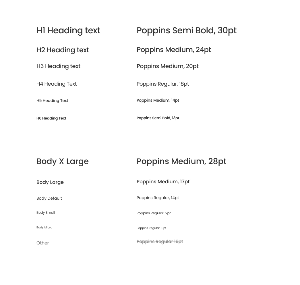
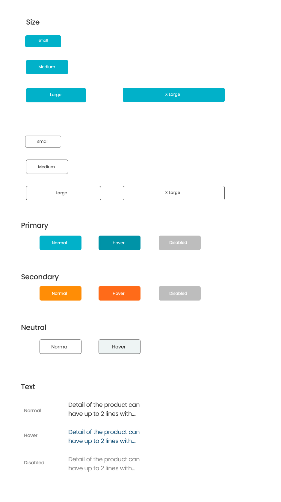
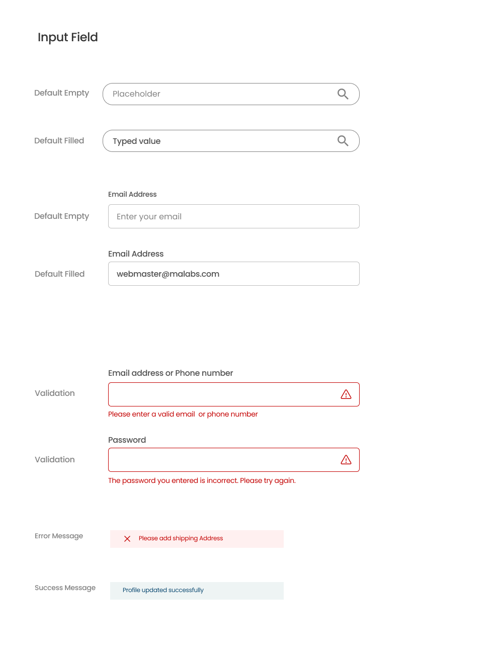
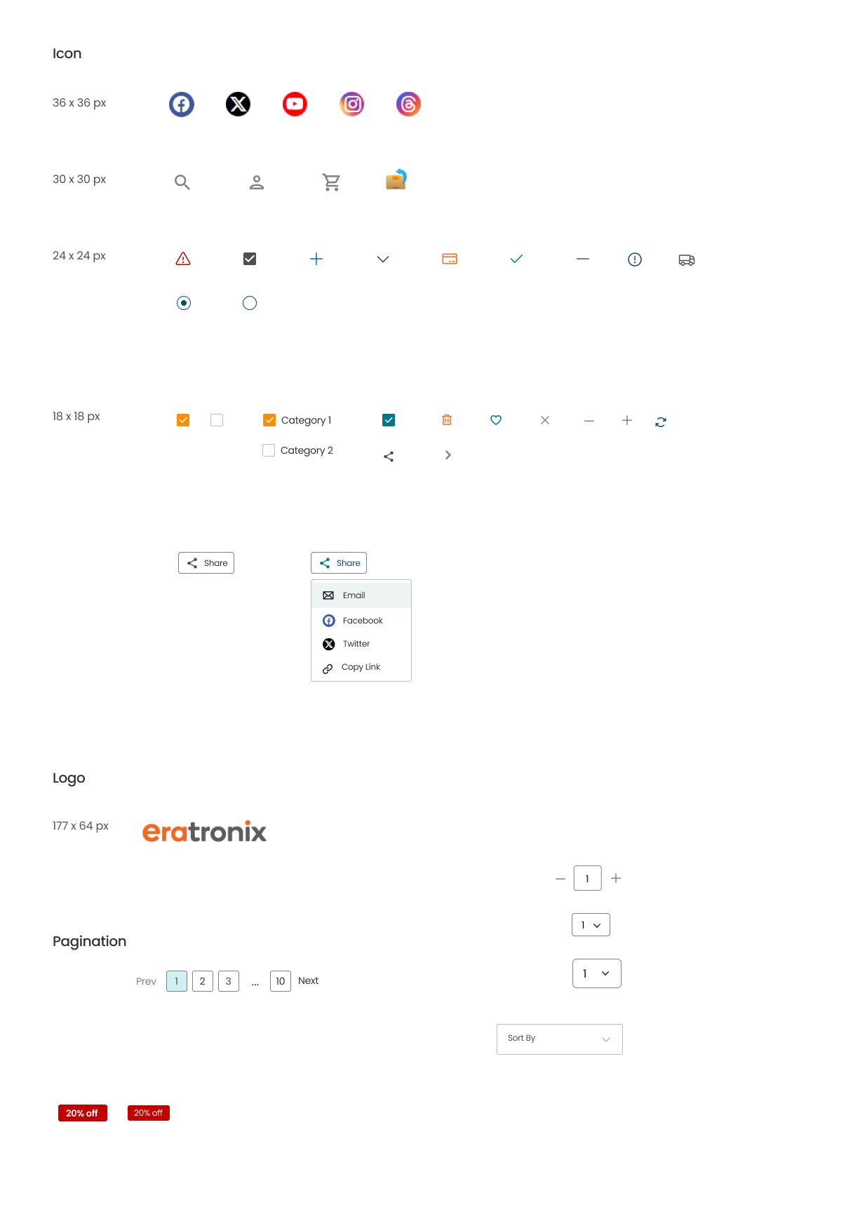
Design System
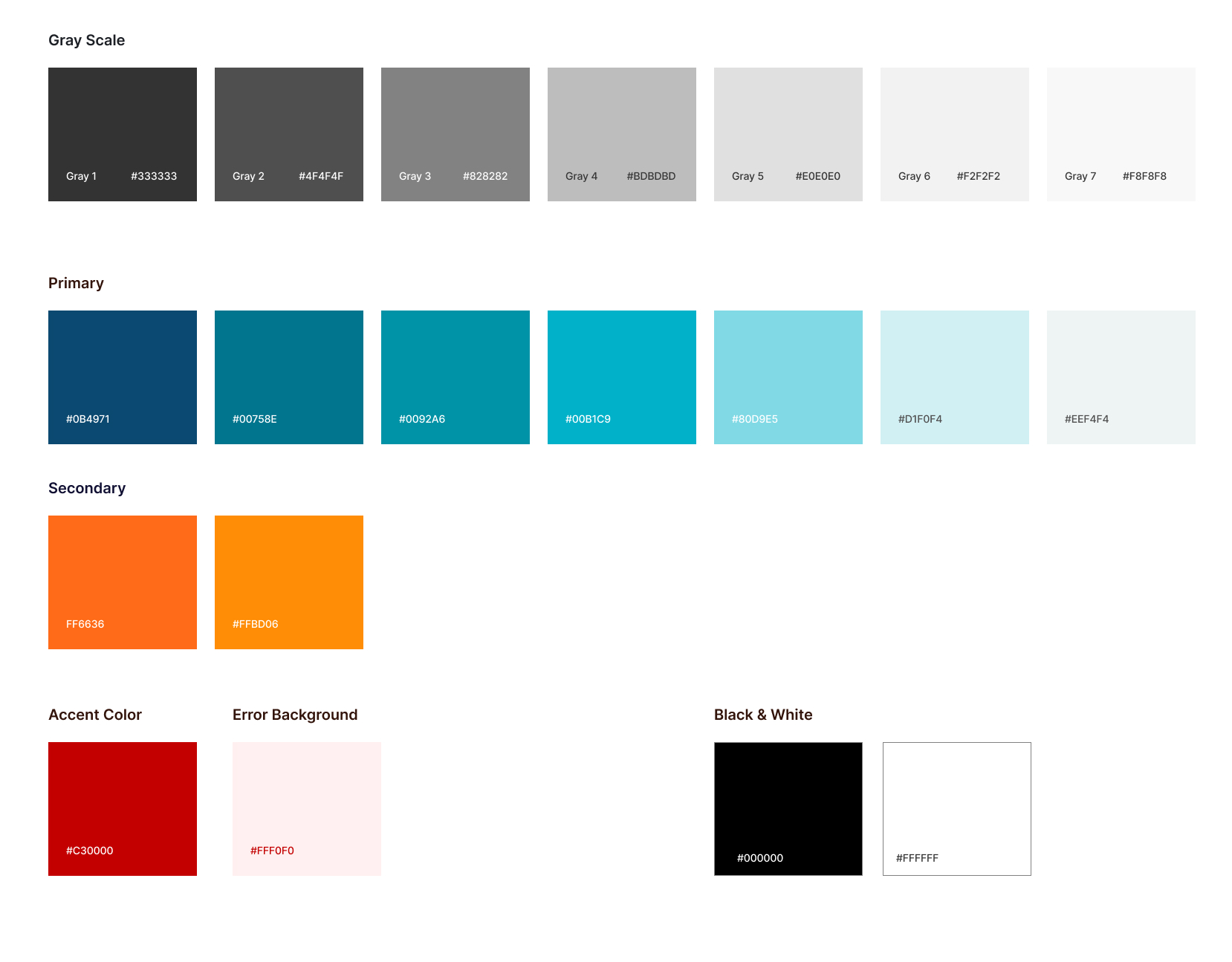
As part of the design process, I independently created and established a color palette that aligned with our brand identity. Additionally, I selected typography and buttons that enhanced readability and contributed to the website’s overall aesthetic.
The final designs were presented with detailed mockups, showcasing the responsiveness across various devices. Included in this section are screenshots of the wireframes with descriptions, illustrating the thought process and iterations that led to the final design.
Responsive Layout
I worked closely with the web master to make sure the website looked great and worked well on all devices, from desktops to mobile phones. We designed layouts that adapted to different screen sizes and continuously tested and refined the responsive design. Our teamwork ensured the website was both attractive and functional on any device.
Mobile Layout
I designed an easy-to-use and visually appealing mobile interface for our e-commerce site. This involved adapting the desktop design to work well on smaller screens while keeping all functions and navigation simple. My work ensured the site was fully responsive, offering a great experience on any device.
Achievements
Successfully launching Eratronix.com on schedule, we achieved a modern, customer-centric platform that significantly improves user experience and engagement. The website’s design not only met but exceeded our initial goals, providing a seamless and intuitive shopping experience. This effort supported business growth by attracting more customers and improving sales performance.