Young caucasian man sitting outdoor on a rock working on a laptop pc in mountain area. Summer season, European Alps.

About the Project

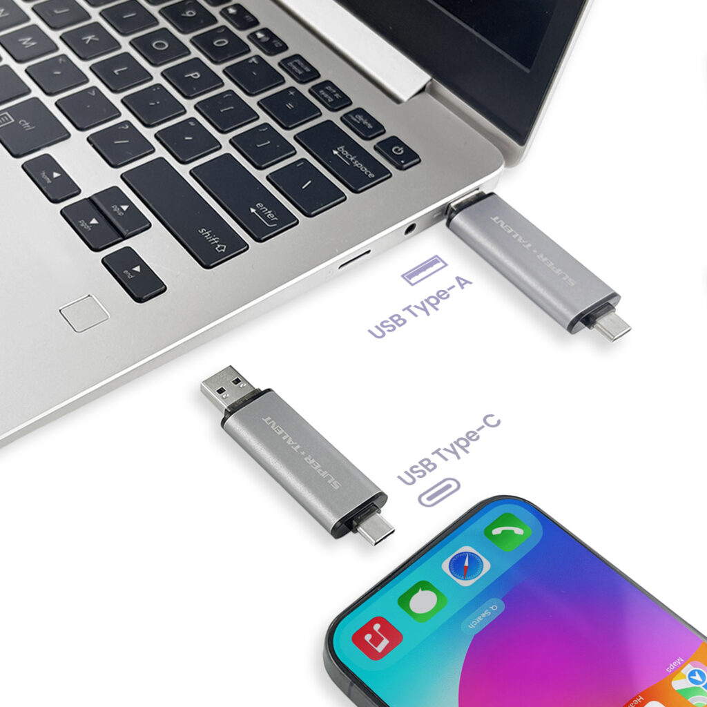
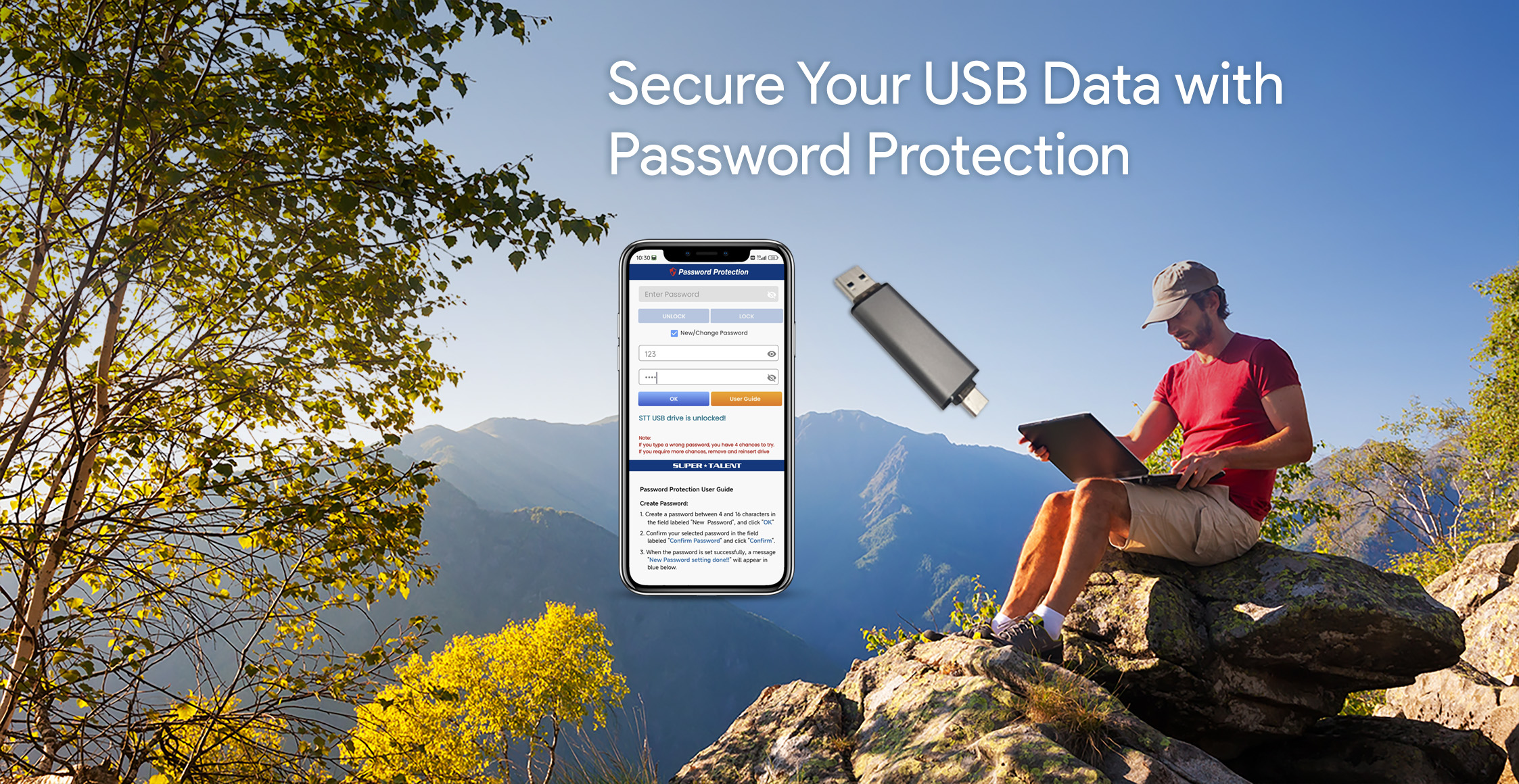
DataGuardian is a secure storage app for USB drives with password protection. The existing layout had usability issues, but major changes weren’t possible due to development constraints. To improve the experience, I refined the visual design by updating colors, fonts, and small content elements, making the interface clear and more user-friendly while maintaining security and functionality.

I led the UI redesign for DataGuardian, an app developed to securely store and protect data on a USB drive with password authentication. My goal was to enhance usability, streamline the user experience, and create a more intuitive interface for seamless data management.
Secure your Data

DataGuardian is a secure storage app designed for USB drives, providing password-protected data protection. While the app was fully developed, its original interface had usability challenges. With limited ability to change the layout, I focused on refining the visual design enhancing colors, fonts, and content clarity to create a more user-friendly and intuitive experience without compromising security.

Problem

The existing layout of DataGuardian was confusing and not user-friendly, making it difficult for users to navigate and manage their data effectively. During a meeting with the engineering team, I raised concerns about the usability issues, but due to completed development and limited resources, major structural changes were not possible. This constraint made it challenging to improve the overall experience while keeping the core design unchanged.

Solution

Despite these limitations, I focused on the aspects I could improve—color themes, font styles, and small content adjustments—to enhance clarity and usability. By carefully refining these elements, I was able to create a more visually cohesive and user-friendly experience without altering the core layout. These subtle yet impactful changes helped improve navigation, readability, and overall user satisfaction while maintaining the app’s security and functionality.

Design Process

1. Identifying the Problem

After reviewing DataGuardian’s interface, I found the existing layout confusing and not user-friendly. In a discussion with the engineering team, I raised concerns about usability issues, but due to completed development and resource constraints, major structural changes were not feasible.

2. Working Within Constraints

Since I couldn’t modify the core layout, I focused on areas where I could make an impact—visual design and content clarity. I analyzed the current UI and identified opportunities to improve readability, navigation, and overall user experience through subtle design enhancements.

3. Enhancing Visual Clarity

To improve usability, I refined the color scheme to create better contrast, updated font styles for better readability, and made small content adjustments to improve navigation and clarity. These changes helped make the interface more intuitive without altering the existing structure.

4. Outcome and Impact

Through careful refinements, I enhanced the app’s overall user experience, making it clearer and more user-friendly while maintaining security and functionality. Despite limitations, these subtle yet meaningful improvements resulted in a more polished and accessible design.

UI Design

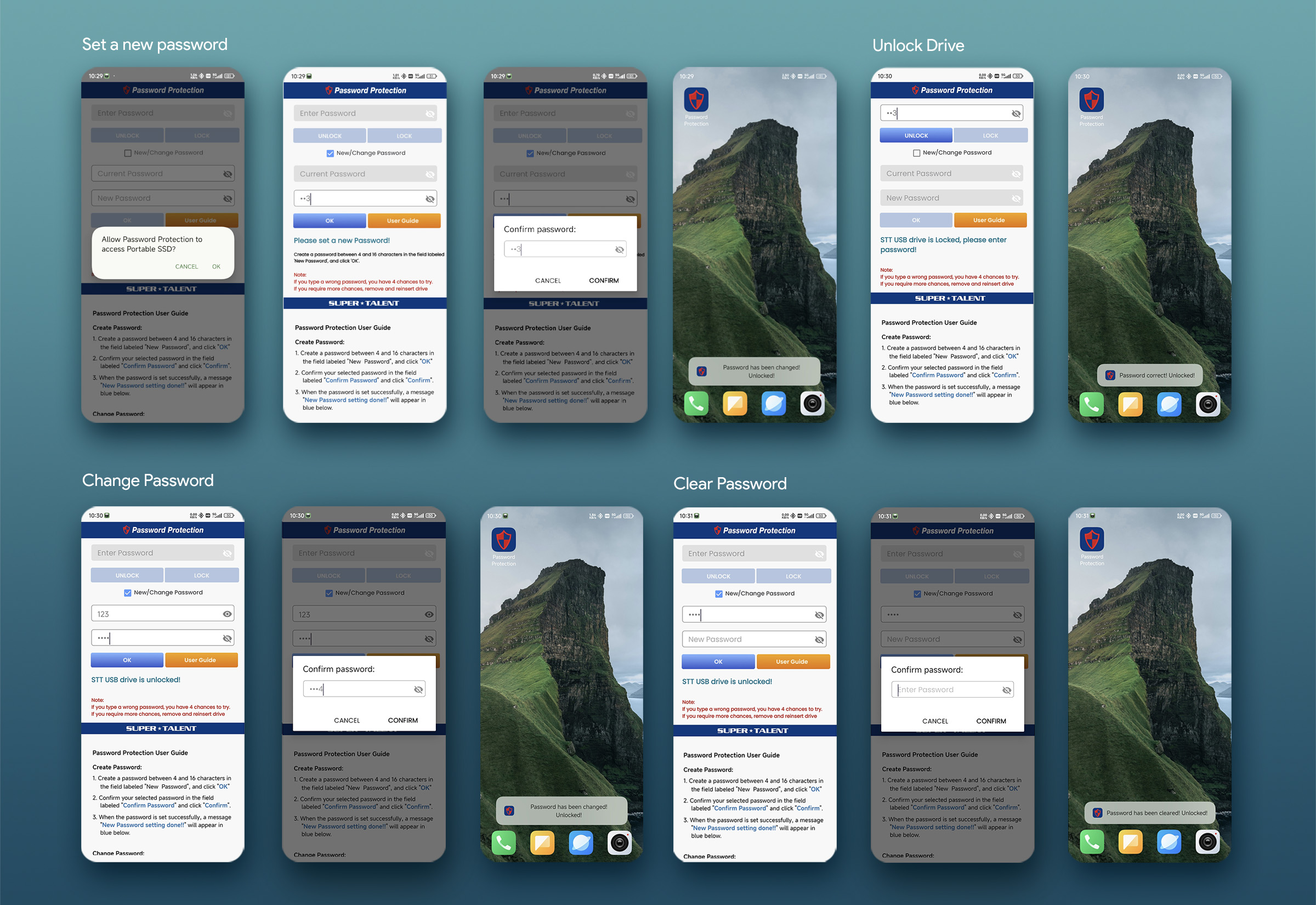
Set up a new password screen

Before

When users insert the USB drive into their phone, they are required to set up a password for secure access. However, the existing layout lacked clear instructions on how to use the drive or complete the password setup process, leading to potential confusion.

After

I enhanced the layout by improving color contrast for better visibility and incorporating clear on-screen instructions to guide users through the setup process. Additionally, I added an important notice to ensure users understand key security details.

Enter password screen

Before

The password input field shows an ‘X’ icon, making it unclear that users could reveal their password. During a meeting, I asked about the process for users who forget their passwords and whether a “Forgot Password” option was available. This led to the discovery that after four incorrect password attempts, the data would be locked, requiring users to contact customer service for assistance.

After

I improved the password input field by replacing the ‘X’ icon with an ‘eye’ icon, ensuring users could easily toggle password visibility. I also added a warning message to notify users that four incorrect password attempts would lock their data, requiring customer service assistance. These changes made the interface more user-friendly and helped prevent potential confusion and frustration.

Change password

Before

I had a meeting with the engineering team to discuss my concerns about the current layout, which I found confusing and not user-friendly. However, they explained that the layout couldn’t be changed at this stage due to completed development and limited resources. To enhance the user interface within these constraints, I proposed updates to color and font styles to improve clarity and usability.

After

Based on the meeting, I recommended updates to color usage and font styles to enhance the user interface. Additionally, I suggested content improvements for better clarity, such as changing “Password” to “Enter Password,” “Old Password” to “Current Password,” and “Help” to “User Guide.”

style guide

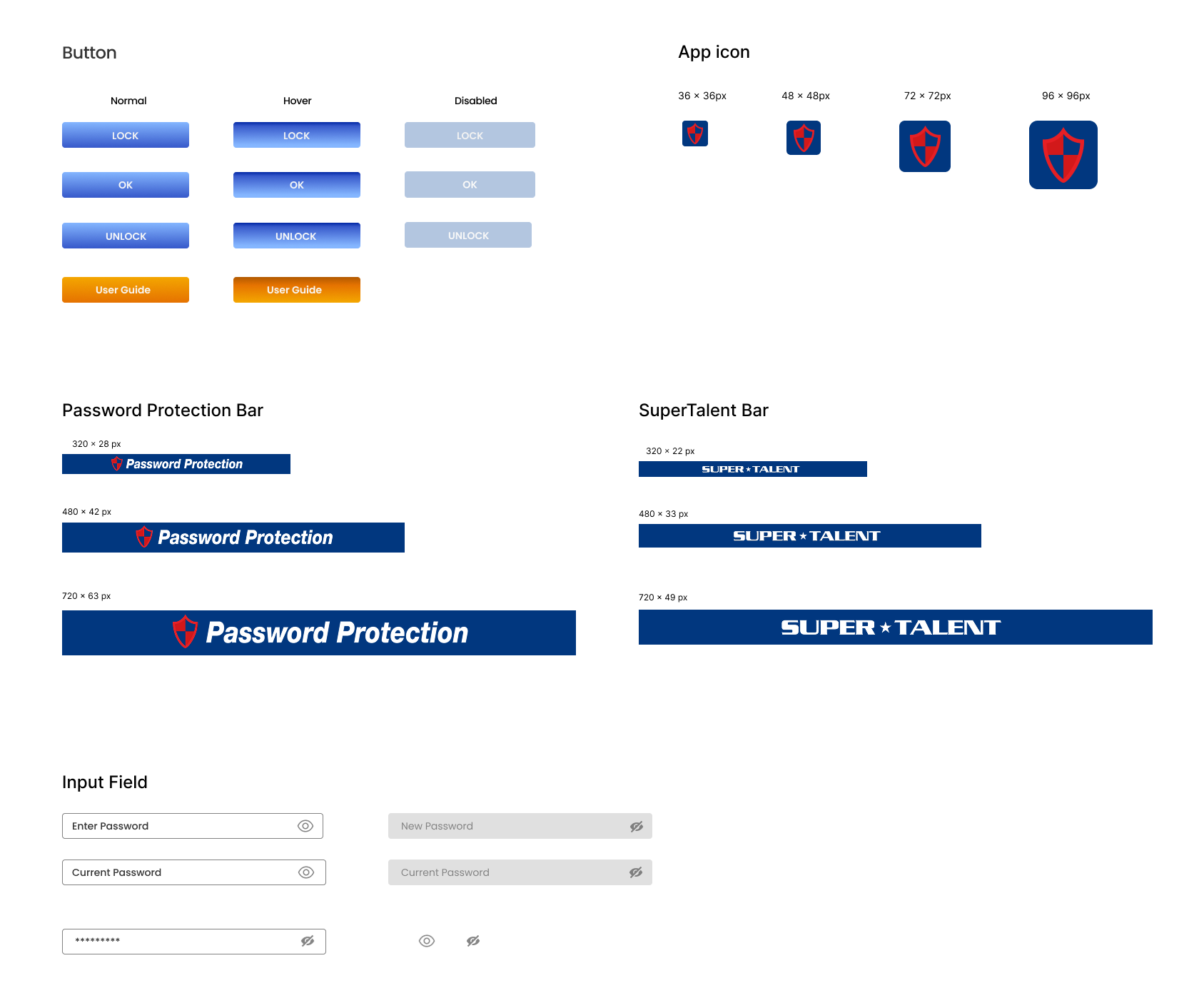
I met with the engineering team to discuss the necessary steps for implementing my design into the app. Since they were unfamiliar with Figma, I adapted my communication approach by providing detailed specifications, including color codes, font styles, and graphic elements like buttons. I ensured they had everything needed for a smooth workflow, facilitating a seamless integration of the design updates.

Style

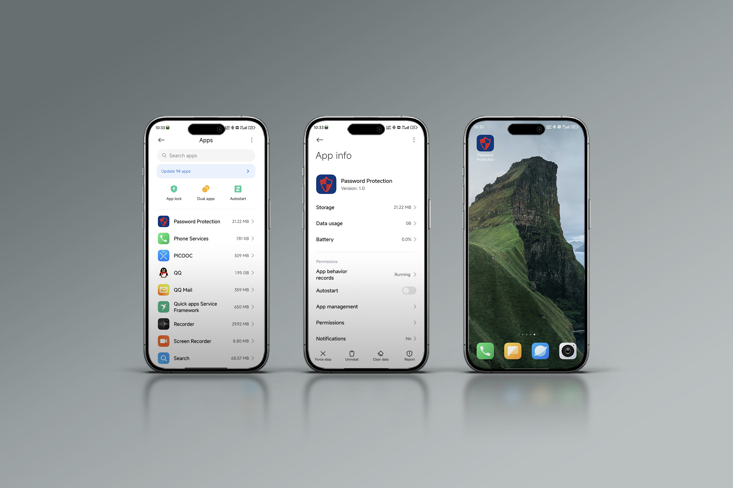
app store

As a result, we successfully launched DataGuardian on the App Store, making secure and user-friendly data protection accessible to a wider audience.

app store_1

Achievement

The successful redesign and launch of DataGuardian on the App Store led to a notable improvement in user engagement and customer satisfaction. Despite strict development constraints, the design enhancements contributed to a more polished and trustworthy product experience, which helped strengthen the company’s brand image in the secure data storage market. Following the launch, the app saw an increase in downloads and positive user feedback, directly supporting sales of the compatible USB drives. The improved user experience played a key role in driving product adoption and boosting overall revenue.

Modern user interface design template. Conceptual mobile phone s